How to Optimize Your Website for Google Mobile First Indexing

Why Mobile-First SEO Determines Your Google Rankings Today
Mobile-first SEO is no longer optional — it is how Google decides where your website ranks, for every search, on every device.
Here is what that means in plain terms:
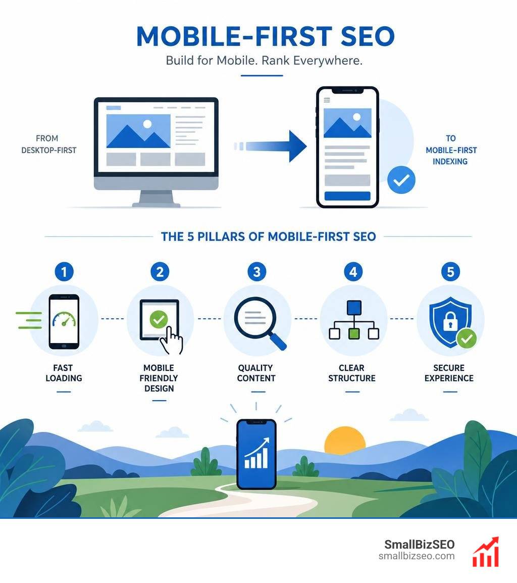
What is mobile-first SEO? Mobile-first SEO is the practice of optimizing your website so that Google's smartphone crawler can fully access, read, and rank your content. Since Google completed its shift to mobile-first indexing, the mobile version of your site is the only version Google uses to evaluate and rank your pages — even for desktop searches.
The five things that matter most:
- Responsive design — one URL, one codebase, adapts to any screen size
- Content parity — your mobile pages must have the same content, headings, and structured data as your desktop pages
- Page speed — LCP under 2.5 seconds, INP under 200ms, CLS under 0.1
- Crawlability — Google must be able to access your CSS, JavaScript, and images
- Mobile UX — tap targets, readable fonts, no intrusive pop-ups
If any of these are broken on mobile, your rankings suffer — even if your desktop site looks perfect.
Consider this: a potential customer searches for your service on their phone, lands on a page that loads slowly or is hard to navigate, hits the back button, and clicks your competitor's link instead. That lost visit also signals to Google that your page did not satisfy the user — which quietly pushes your rankings down over time.
The good news is that fixing mobile SEO is very achievable, even for small business owners without a technical background.
Over 64% of worldwide internet traffic now comes from mobile devices. Google responded by making the mobile version of your site the primary source it uses for crawling and ranking. That shift is permanent and complete.
I'm Clayton Johnson, a digital PR and SEO strategist who has helped businesses improve their search visibility through targeted mobile-first SEO campaigns and technical site optimization. In this guide, I'll walk you through exactly what to fix, in what order, so you can stop losing rankings to better-optimized competitors.
Understanding Mobile-First Indexing and the Core Pillars of Mobile-First SEO
To succeed in search today, we must understand how Googlebot Smartphone operates. In the past, Google used a desktop-first indexing model. It would crawl your desktop site, assess its quality, and use that evaluation to rank your pages for both desktop and mobile users. The mobile version of your site was treated almost like an afterthought.
Today, that relationship is completely reversed. Googlebot Smartphone is now the primary crawler for the web. When Google evaluates your site, it looks at the mobile version of your pages first. If your mobile site is missing content, has broken layouts, or loads too slowly, your rankings will tank across all devices—including desktop.
To help visualize this massive shift, we can look at the core differences in how Google handles indexing now compared to the past:
| Feature | Desktop-First Indexing (Legacy) | Mobile-First Indexing (Current) |
|---|---|---|
| Primary Crawler | Googlebot Desktop | Googlebot Smartphone |
| Ranking Baseline | Evaluated using desktop layout and content | Evaluated using mobile layout and content |
| Content Evaluation | Content hidden in tabs on desktop was discounted | Content in mobile tabs/accordions is fully indexed |
| Speed Metrics | Measured on desktop broadband speeds | Measured on mobile connections |
This fundamental change is explored in detail within the resource on Mobile-First Indexing Impact and SEO Requirements, which highlights how a flawless desktop experience cannot save your business if your mobile layout is lacking.

Implementing Responsive Design for Mobile-First SEO
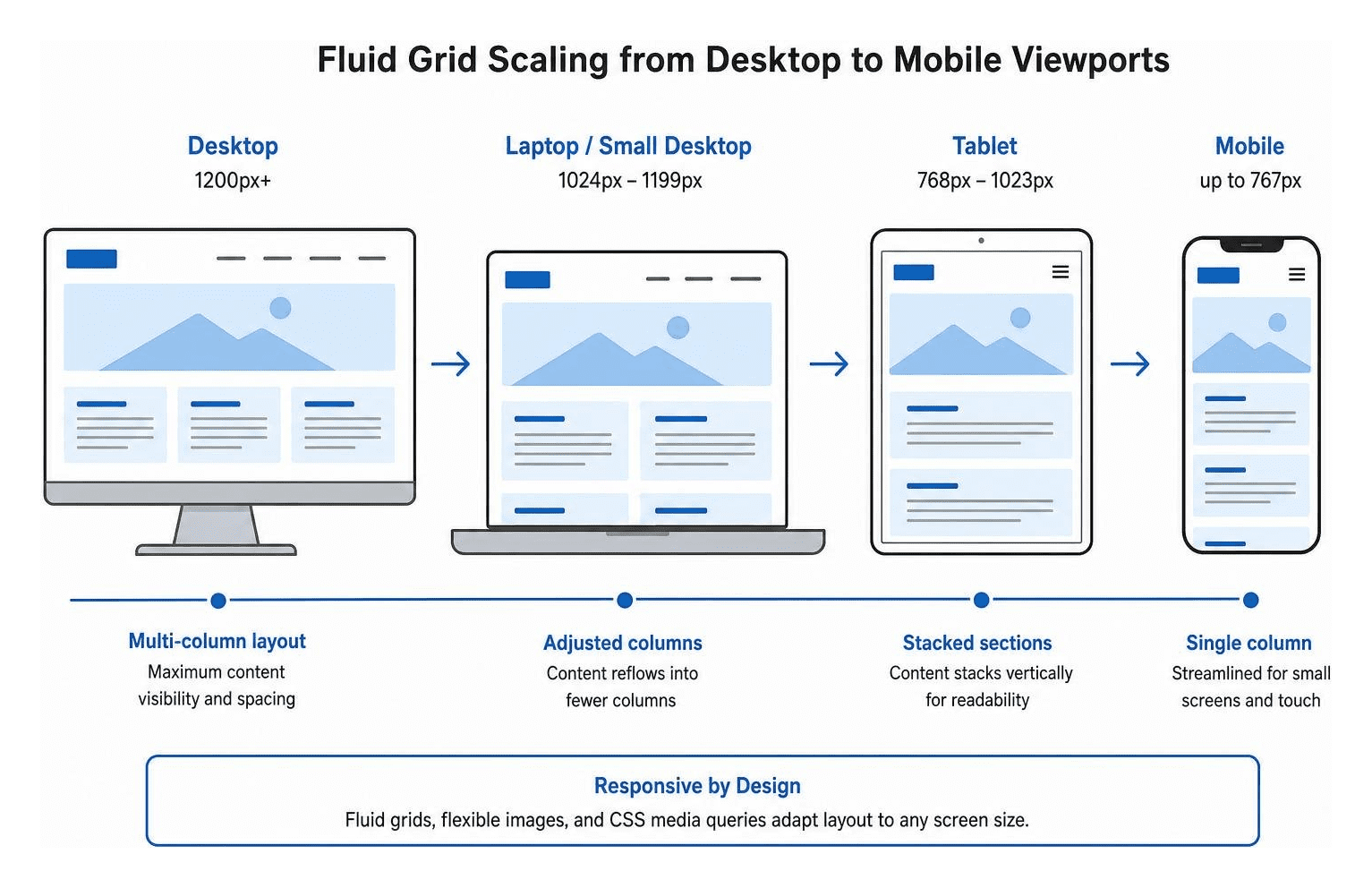
When choosing a mobile setup, we strongly recommend responsive web design. In fact, it is the only pattern worth building. Responsive design uses fluid grids, flexible images, and CSS media queries (along with modern container queries at the component level) to automatically adapt your website's layout to whatever screen size the visitor is using.
By using responsive design, you serve the exact same HTML and CSS on a single URL. This eliminates the duplicate content headaches, complex redirect chains, and split link equity associated with legacy separate mobile URLs (such as a separate "m." subdomain).
To make sure your responsive design is configured correctly, you must include the viewport meta tag in the head of your HTML. This tag tells mobile browsers how to scale your content to fit the screen. Without it, mobile browsers will render your page at desktop width and shrink it down, making it unreadable.
Ensure your code includes this essential tag: a viewport meta tag with width set to device-width and initial-scale set to 1
For more advanced configurations, review Google Search Central's Mobile-First Indexing Best Practices to keep your responsive patterns perfectly aligned with search engine expectations.
Ensuring Content Parity Across Devices
One of the most common mistakes we see during site audits is a lack of content parity between desktop and mobile. In an effort to make mobile pages look clean, developers sometimes strip out text, hide product descriptions, remove structured data, or omit helpful headings on the mobile version.
Under mobile-first indexing, if content does not exist on your mobile site, Google does not see it. Period. If you have a detailed, high-ranking page on desktop, but you hide half the text on mobile to save screen space, your rankings will drop because Google is only indexing the thinner mobile version.
To achieve complete content parity, we must ensure that:
- All primary text, images, and videos are identical on both versions.
- Headings (H1, H2, H3 tags) remain consistent across devices.
- Structured data (schema markup) is fully implemented on the mobile version.
- Meta titles, meta descriptions, and alt text are equivalent on both layouts.
For a deeper dive into structuring your content elements for both search engines and users, check out our guide on On-Page SEO. Additionally, you can learn how to keep your content trust signals strong across all devices by reading our E-E-A-T Content Optimization Guide.
Technical Optimization and Mobile Page Speed
Mobile page speed is a critical ranking factor. On a mobile device, users are often browsing on slower wireless networks and using processors that are significantly less powerful than desktop computers. Because of this, a page that loads in under two seconds on desktop can easily take over six seconds on a mid-tier mobile device.
To measure and improve mobile performance, Google uses Core Web Vitals. These metrics focus on the real-world user experience of loading speed, interactivity, and visual stability:
- Largest Contentful Paint (LCP): Measures loading performance. For a good user experience, LCP should occur within 2.5 seconds of when the page first starts loading.
- Interaction to Next Paint (INP): Measures page responsiveness to user interactions like taps or clicks. A good score is 200 milliseconds or less.
- Cumulative Layout Shift (CLS): Measures visual stability. Pages should maintain a CLS of 0.1 or less to prevent annoying layout jumps while loading.

Media Optimization for Mobile-First SEO
Oversized, unoptimized images are the number one cause of slow mobile loading times. Fortunately, optimizing media is one of the easiest ways to improve your mobile performance.
First, we should convert all images to modern, next-gen formats like WebP or AVIF. These formats offer superior compression, reducing file sizes by up to 35% compared to traditional JPEGs and PNGs without sacrificing visual quality.
Second, we should implement responsive images using the srcset and sizes attributes. This code tells the browser to select and download the image size that best matches the user's screen width, preventing a smartphone from downloading a massive desktop-sized image.
Third, we should use lazy loading for all below-the-fold media. This ensures that images and videos only load as the user scrolls down to them, keeping the initial page load incredibly fast. For additional strategies on enhancing your media performance, refer to the Mobile SEO Guide by SiteGround Academy.
Eliminating Render-Blocking Resources
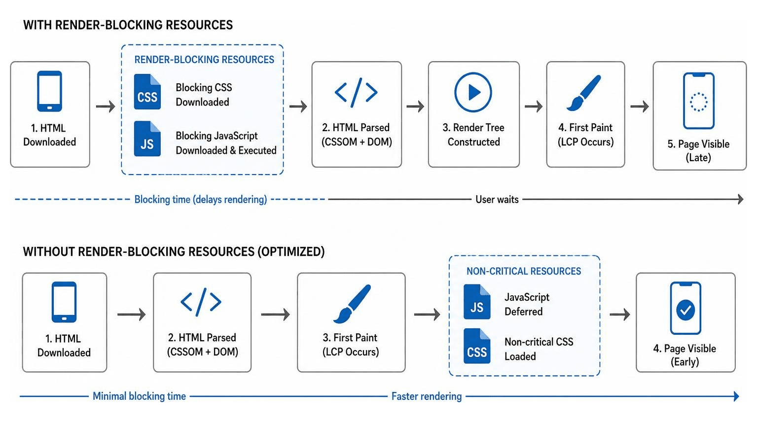
When a browser loads a webpage, it must download, parse, and execute all CSS and JavaScript files before it can render the page for the user. If these files are large or poorly organized, they act as "render-blocking" resources, leaving the user staring at a blank white screen.
To optimize the rendering path, we should:
- Minify CSS and JavaScript files to strip out unnecessary whitespace and comments.
- Defer non-essential JavaScript so it loads after the main page content has rendered.
- Inline critical CSS needed to render the above-the-fold area of the page.
- Clean up unused third-party scripts that delay main-thread execution.
By tackling these technical issues, we can significantly lower mobile bounce rates and keep users engaged. If you need expert assistance in diagnosing and eliminating these bottlenecks, explore our comprehensive SEO Services to get your site running at peak velocity.
Common Mobile Indexing Issues and How to Fix Them
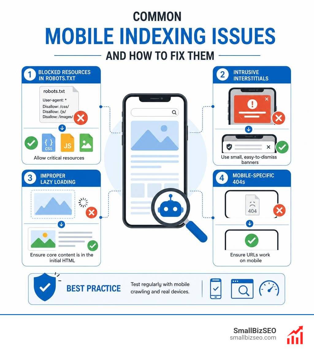
Even with a beautiful responsive design, technical indexing errors can quietly sabotage your SEO efforts. Here are the most common mobile indexing issues we encounter and how to fix them:
- Blocked Resources in robots.txt: In the past, webmasters sometimes blocked Googlebot from crawling CSS, JavaScript, or image folders to save server bandwidth. Today, Google must be allowed to access these files so it can properly render and understand your mobile layout. Ensure your
robots.txtfile is not blocking critical assets. - Intrusive Interstitials: Full-screen pop-ups that block the main content immediately after a user lands on your mobile page can lead to ranking penalties. Instead, use small, easily dismissible banners for promotions or cookie consents.
- Improper Lazy Loading: If you lazy load your primary text content or images using JavaScript that requires user interaction (like clicking a "read more" button), Googlebot may fail to index that content. Always ensure your core text is present in the initial server-rendered HTML.
- Mobile-Specific 404s: Sometimes a URL works perfectly on desktop but returns a 404 error page on mobile due to faulty redirect rules or dynamic serving configurations.
You can find more detailed advice on avoiding these common pitfalls in Shopify's Mobile-First Indexing Best Practices, which offers excellent troubleshooting tips for ecommerce platforms and standard websites alike.
Frequently Asked Questions About Mobile SEO
Navigating mobile optimization can bring up plenty of technical questions. Here are the answers to the questions we hear most often from business owners.
How do I check if my website is mobile-friendly?
You can easily check your site's mobile-friendliness and crawlability using Google Search Console.
Simply log in, navigate to the URL Inspection tool, and paste in any page URL. Look at the coverage report to verify that the page is marked as "Crawled as: Googlebot Smartphone." If it shows desktop Googlebot, your page may still be on a legacy crawl path.
You should also run your URLs through PageSpeed Insights. This tool analyzes your mobile performance, flags usability issues (like text that is too small to read or touch targets that are too close together), and provides clear, actionable steps to fix them.
Does hiding content in accordions or tabs hurt mobile rankings?
No, hiding content behind accordions, tabs, or "read more" menus on mobile does not hurt your rankings, provided the content is present in the page's HTML when it loads.
Google understands that screen space is limited on smartphones. As long as the content is technically crawlable and does not require custom JavaScript interaction (like an AJAX call) to fetch the text, Googlebot Smartphone will fully index and weigh that content just like visible text.
How does mobile optimization affect local search visibility?
Mobile optimization and local SEO are deeply connected. In fact, over 76% of local mobile searches result in a store visit within 24 hours. When users search for services on their phones, they are often looking for immediate, local solutions.
To capture this high-intent traffic, we must optimize for local mobile search by:
- Maintaining consistent Name, Address, and Phone number (NAP) data across our site and our Google Business Profile.
- Adding prominent click-to-call buttons (
href="tel:") and direct links to map directions. - Ensuring our local landing pages load instantly on standard mobile connections.
For a complete blueprint on dominating local search results, check out our comprehensive Local SEO Guide.
Conclusion
Optimizing for mobile-first indexing is no longer a minor technical chore—it is the very foundation of search engine visibility. If your mobile site is slow, hard to navigate, or missing core content, your business will struggle to compete in search results.
At SmallBizSEO, we help small businesses navigate these technical complexities with ease. Through our proprietary "Velocity" framework, we deliver fast rankings and search growth backed by transparent, automated reporting. We take the guesswork out of technical SEO and content strategy, ensuring your website is perfectly optimized for both Googlebot Smartphone and real human visitors.
Ready to claim your search visibility? Partner with us and explore our SEO services to schedule a technical mobile audit today.