A Practical Guide to Testing Viewports on Modern Smartphones
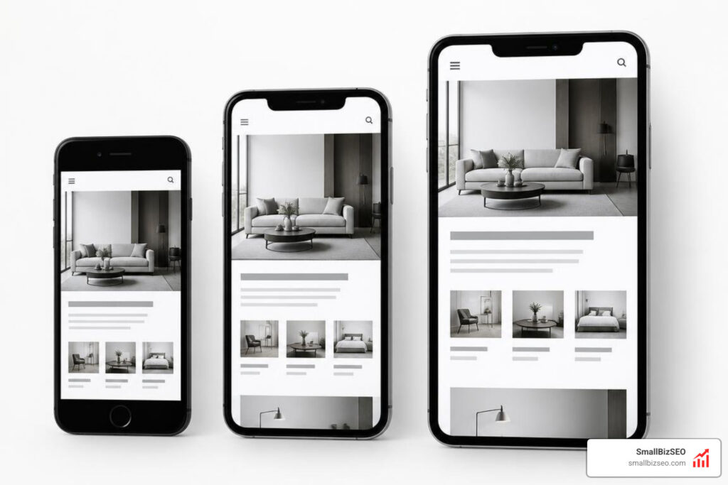
How do you test what visitors see first on a mobile screen?
Here’s how to test above-the-fold content across common mobile screens: open your page at a compact 360-pixel width, a 390-pixel width, and a larger 430-pixel width. At each size, check what appears before scrolling. Can visitors read the headline, understand the offer, and find the next step? Then test on a real iPhone and Android phone, since browser toolbars and pop-ups can change what people actually see.
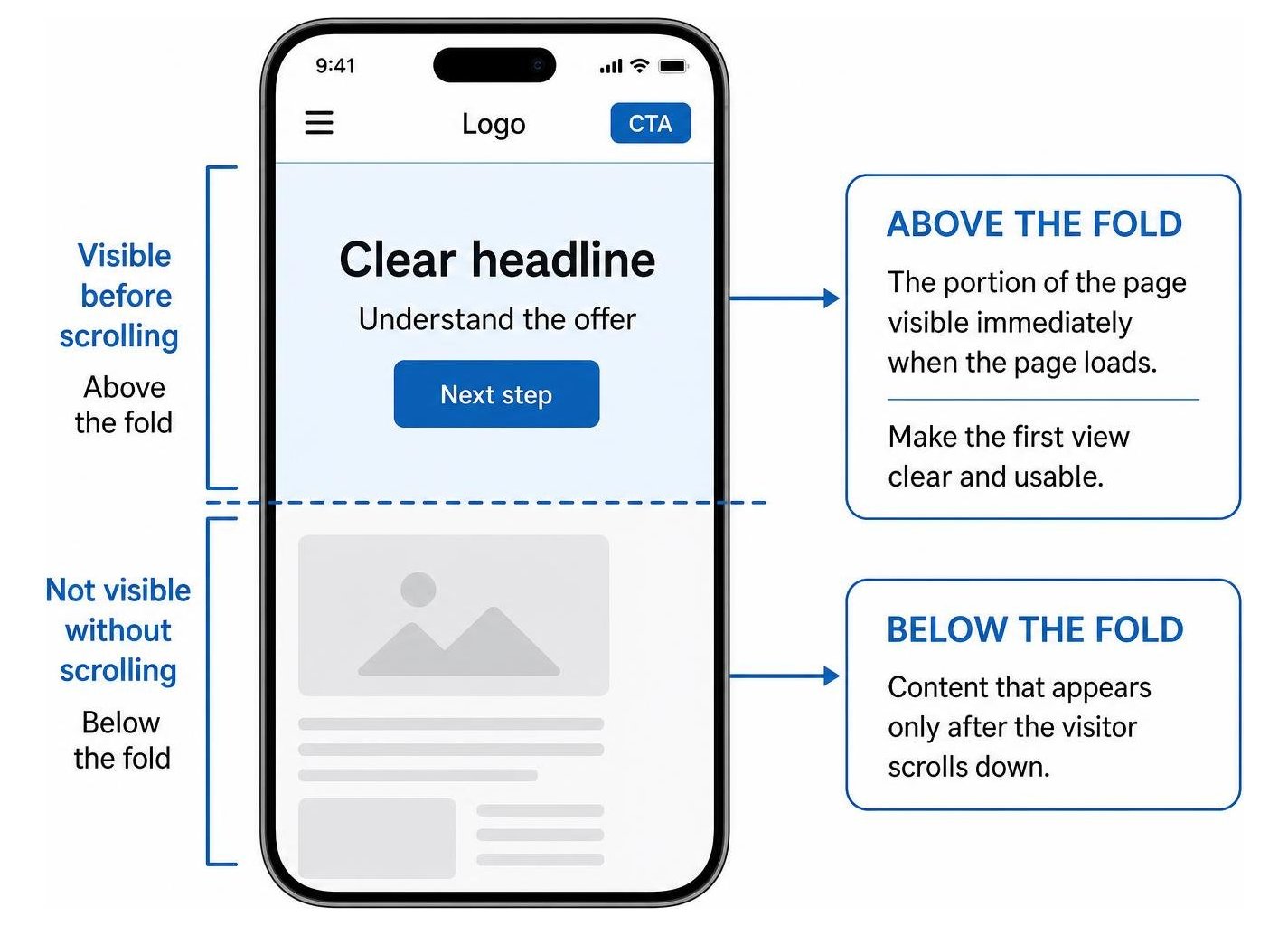
The fold is not one fixed line. Font size, sticky headers, and loading delays can all push useful content out of the first view. The goal is not to fit the whole page there. It is to make that first view clear and usable.
I’m Clayton Johnson, founder of SmallBizSEO, where I connect technical SEO and content strategy to small businesses’ need for qualified leads. I use that experience to explain how to test above-the-fold content across common mobile screens with the visitor’s first impression in mind.
What Is the Mobile Fold, and How Much Space Is Above It?
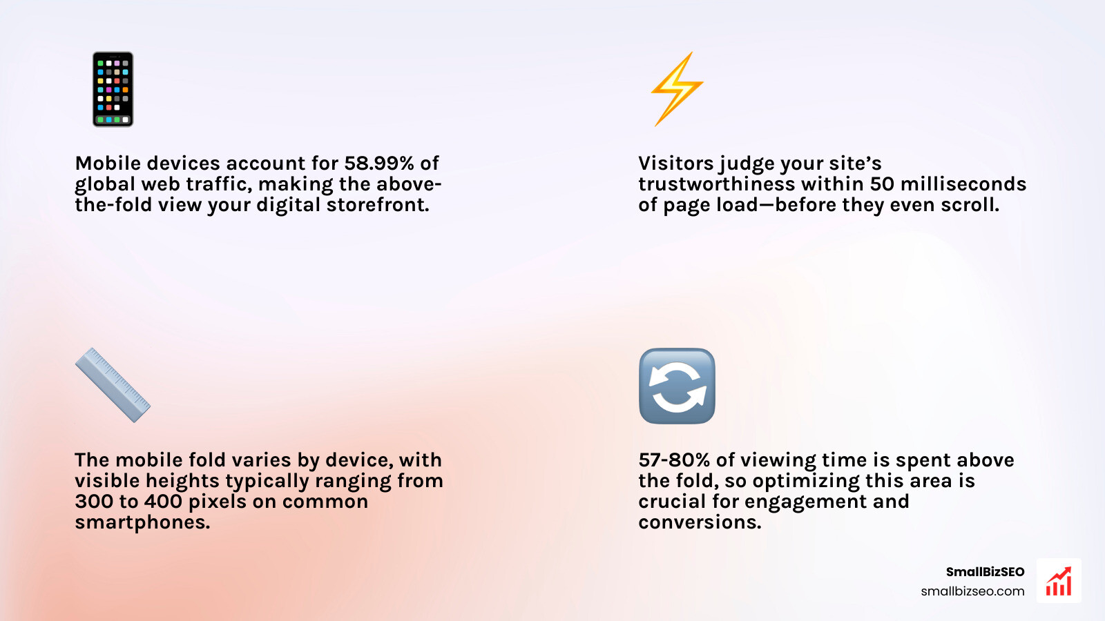
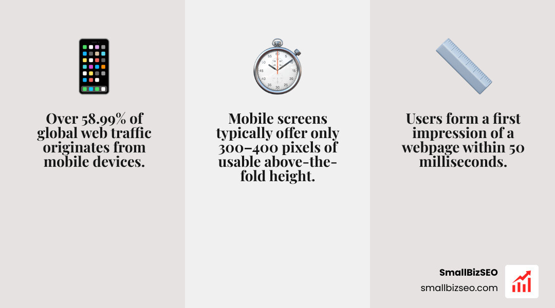
The mobile fold is the portion of a webpage visible immediately when a page loads, before a visitor swipes or scrolls downward. Because mobile phones account for 58.99% of global web traffic, this initial view represents your digital storefront window.
Research from Google and the Missouri University of Science and Technology shows that visitors form a first impression within 50 milliseconds. That is faster than the blink of an eye. In that tiny fraction of a second, users decide if your site looks trustworthy, professional, and relevant.
While desktop monitors provide between 600 and 800 vertical pixels of initial room, mobile screens often offer only 300 to 400 pixels of usable height once browser navigation bars, system status indicators, and headers render. This makes every pixel in the initial viewport critical real estate.
Where Does the Mobile Fold Fall on Modern Device Dimensions?
The fold line shifts across device models because hardware resolutions and aspect ratios vary widely. Operating systems also add top status bars and bottom navigation handles that reduce visible vertical room.

When browsers like Safari or Chrome load, they include top URL bars and bottom navigation menus (browser chrome) that collapse only after the user begins scrolling. A site designed for a theoretical screen height often loses 100 to 140 pixels to these interactive controls on initial paint.
| Device Category | Example Hardware | Viewport Dimensions (CSS Pixels) | Typical Visible Fold Height | Aspect Ratio |
|---|---|---|---|---|
| Compact Phone | iPhone SE, Older Galaxy | 375 × 667 / 360 × 640 | 320 – 380 px | 16:9 |
| Standard Modern Phone | iPhone 14/15/16, Pixel 8 | 390 × 844 / 393 × 851 | 420 – 480 px | ~19.5:9 |
| Large Flagship Phone | iPhone Pro Max, Galaxy Ultra | 430 × 932 / 412 × 915 | 490 – 560 px | ~19.5:9 |
| Foldable (Outer Screen) | Galaxy Z Fold Series (Cover) | 344 × 882 | 400 – 450 px | 23:9 (Tall/Narrow) |
Why Does Testing Above-the-Fold Content Across Common Mobile Screens Protect Conversions?
Testing your initial screen area protects conversions by ensuring visitors immediately see who you are, what you offer, and what action to take next. Nielsen Norman Group eye-tracking studies reveal that users spend between 57% and 80% of their total viewing time above the fold.
Even though 90% of mobile users begin scrolling within 14 seconds of landing, they only scroll if that opening view answers their search intent. If a bloated hero image or oversized header pushes your core value proposition off-screen, bounce rates spike.
Fast loading is just as vital. On 70% of mobile landing pages, visual content above the fold takes longer than 5 seconds to display. Think with Google research shows that 53% of mobile visitors abandon sites taking longer than 3 seconds to load. Adopting systematic above-the-fold content optimization and routine mobile friendly testing ensures your messaging displays within a crisp 1 to 2-second window.
How Do You Test Above-the-Fold Content Across Common Mobile Screens?
To evaluate your mobile layout thoroughly, you need a testing workflow that blends browser-based viewport emulation, synchronized responsive tools, and real physical device checks.

Testing requires inspecting how dynamic elements behave when stacked together. Sticky navigation bars, promotional countdown banners, hamburger menus, and cookie consent overlays can consume 80% of the visible fold on compact screens if left unchecked.
How Do You Build a Smartphone Viewport Matrix for Testing?
A smartphone viewport matrix is a deliberate checklist of screen widths that represent your actual audience traffic without requiring hundreds of individual phone models.
When building your matrix for modern responsive web design, include these core layout classes:
- Compact Mobile (360px – 375px width): Covers budget Android phones and compact models like the iPhone SE. This checks your layout against extreme vertical and horizontal space constraints.
- Standard Mobile (390px – 412px width): Represents the vast majority of modern mobile traffic, including standard iPhone and Google Pixel models.
- Large / Flagship Mobile (430px width): Verifies that typography and heroes scale cleanly on modern high-resolution screens without excessive white space.
- Foldables and Tall Aspect Ratios (344px width): Verifies narrow viewports where long headlines can wrap into four or five lines and push action buttons out of sight.
For engineering teams looking to standardize these layout categories across operating systems, official Android testing for different screen sizes provides detailed guidance on compact, medium, and expanded window size classes.
How Can You Test Above-the-Fold Content Across Common Mobile Screens Step by Step?
Evaluating your layout works best when you follow a structured, repeatable sequence across your viewport matrix.
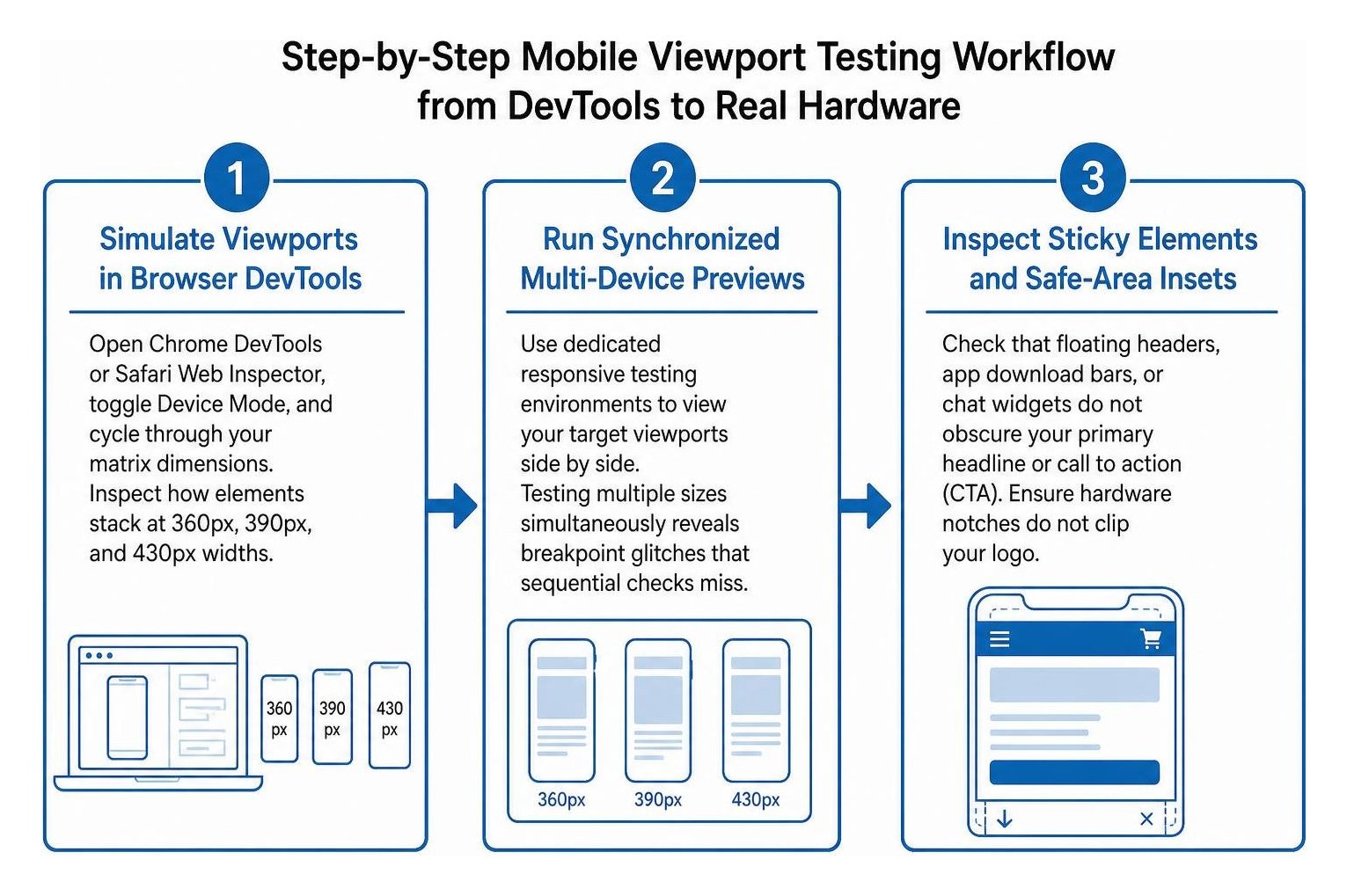
Here is the exact process to follow:
- Simulate Viewports in Browser DevTools: Open Chrome DevTools or Safari Web Inspector, toggle Device Mode, and cycle through your matrix dimensions. Inspect how elements stack at 360px, 390px, and 430px widths.
- Run Synchronized Multi-Device Previews: Use dedicated responsive testing environments to view your target viewports side by side. Testing multiple sizes simultaneously reveals breakpoint glitches that sequential checks miss, as detailed in responsive multi-device testing methods.
- Inspect Sticky Elements and Safe-Area Insets: Check that floating headers, app download bars, or chat widgets do not obscure your primary headline or call to action (CTA). Ensure hardware notches do not clip your logo.
- Test Accessibility and User Preference Toggles: Toggle system font scaling up to 120% or 140% to confirm larger text does not break containers. Verify that dark mode maintains readable contrast and that reduced motion settings disable disorienting auto-play banners.
- Validate on Physical Hardware: Load the page on at least one real iOS device running Safari and one real Android phone running Chrome. Physical hardware testing confirms touch responsiveness, real browser toolbar collapsing behavior, and actual font rendering.
How Can You Automate Viewport Checks with Screenshot and CI Tools?
Automated visual regression testing captures programmatic screenshots of your key landing pages across predefined viewports during continuous integration (CI) builds.

By using automation frameworks like Playwright or headless Chromium scripts, you can render your page across 360px, 390px, 414px, and 768px widths automatically upon every code release.
These tools compare current visual output against baseline screenshots, flagging unexpected changes with pixel-level diffing. Automation catches subtle responsive bugs, such as off-by-one media query errors (like an element breaking at 374px instead of 375px), container query collapses, and text wrapping issues on critical CTA buttons before updates go live.
How Do You Optimize and Monitor Viewport Performance Across Devices?
Optimizing above-the-fold real estate requires pairing clean layout hierarchy with aggressive performance tuning. Even an attractive hero section fails if it takes four seconds to render on a cellular connection.
To deliver an exceptional mobile experience:
- Prioritize a single primary objective above the fold with a clear headline, concise value proposition, and prominent CTA.
- Inline critical above-the-fold CSS so the browser can style the initial viewport without waiting for full stylesheets to download.
- Preload key hero assets and use modern WebP or AVIF image formats sized specifically for mobile viewports.
- Lazy-load all images, videos, and scripts positioned below the fold.
Regularly audit your URLs using Google PageSpeed Insights to uncover blocking scripts. Monitor your real-world performance against official Core Web Vitals benchmarks, ensuring Largest Contentful Paint (LCP) clocks in under 2.5 seconds and Cumulative Layout Shift (CLS) stays below 0.1 so elements do not jump around while loading.
How Do You Analyze Scroll Depth, Core Web Vitals, and User Engagement Metrics?
Once your design is live, rely on user analytics to verify that your first-view layout actually encourages engagement rather than bounces.
Set up scroll depth tracking and heatmaps to observe where visitor attention drops off. Look out for "false bottoms"—visual patterns like solid horizontal background color breaks or excessive white space that make users believe a page has ended when more content exists below.
Ensure interactive buttons and form fields meet standard mobile usability guidelines with minimum 44 × 44 pixel tap targets and comfortable thumb reachability. If you want a comprehensive, data-backed evaluation of how your responsive structure and page speed influence search rankings, request a SmallBizSEO visibility audit to uncover technical bottlenecks and improve your organic conversion path.
Transform Your Mobile First Impression into Lasting Growth
Optimizing what visitors see on mobile screens is no longer about adhering to a rigid, print-era fold line. It is about intentionally engineering the first three seconds of user attention across dozens of screen sizes. By setting up a practical viewport matrix, conducting regular multi-device checks, and eliminating loading delays, you create a seamless mobile entry point that captures attention and turns casual searchers into paying customers.