Above the Fold Blueprint: A Practical Guide to Local Service Hero Sections

How Should You Design Above-the-Fold Content for Local SEO and Scrolling?
What a Local Service Homepage Should Show Before Scrolling to Answer Core Visitor Questions
When a potential client lands on your website, their brain is running a rapid checklist. If they cannot find the answers immediately, they will tap the back button and call your competitor.
Before touching the screen or rolling a scroll wheel, every visitor asks three fundamental questions:
- Do you provide the exact service I need? (Service clarification)
- Do you serve my specific community or neighborhood? (Geographic eligibility)
- Can I trust you enough to contact you right now? (Immediate credibility)
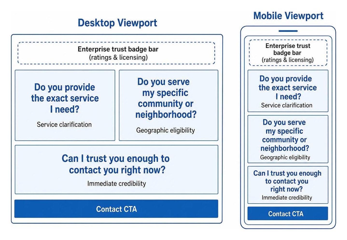
Answering these questions quickly prevents bounce rates from spiking. Dedicated landing pages convert at a 4.02% baseline compared to 2.35% for generic website pages, while top-performing commercial service pages reach conversion rates of 11.4% or higher. When you implement focused tactics to capture high-intent leads, you eliminate the friction that causes searchers to abandon your site.
Independent research such as the Save Main Street local business research highlights how vital digital accessibility is for neighborhood businesses. Framing your hero content in plain, customer-centric language ensures visitors instantly qualify themselves without guessing. This is the practical answer to what a local service homepage should show before scrolling: clear service details, local relevance, and immediate trust signals.
How Should the H1 Headline and Support Line Be Formatted?
Your primary headline (the H1 tag) must state what you do and where you do it. Cute marketing slogans like "Building Dreams with Passion" force the visitor to figure out what you actually sell. If you are an electrician, say so plainly.
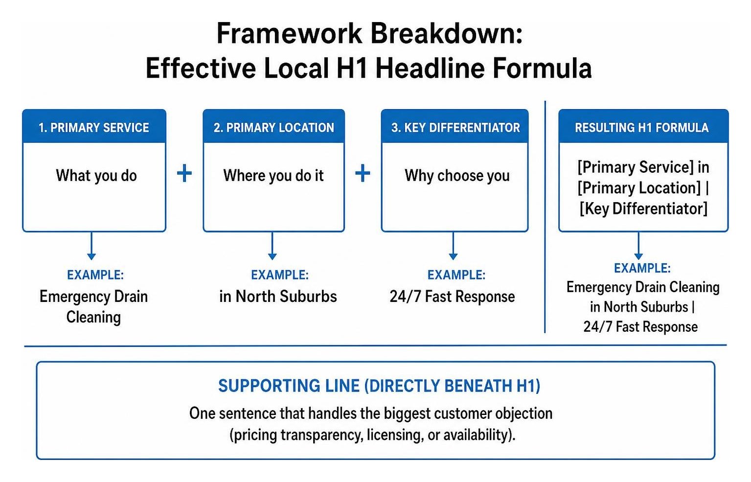
A winning headline formula follows a simple structure:
- The Formula:
[Primary Service] in [Primary Location] | [Key Differentiator] - Example: Emergency Drain Cleaning in North Suburbs | 24/7 Fast Response
Directly beneath the H1, place a one-sentence supporting line that handles the biggest customer objection, such as pricing transparency, licensing, or availability.
- Weak Subheadline: "We have been providing quality service with integrity for decades."
- Strong Subheadline: "Upfront flat-rate pricing, same-day appointments, and zero hidden dispatch fees."
Eliminating jargon and aligning your hero text with the search query creates a seamless bridge from search engine to website. When structuring an individual local landing page, maintaining this direct, search-aligned clarity ensures both search engines and human searchers understand your offering instantly.
How Can a Local Service Homepage Build Immediate Credibility Before Scrolling?
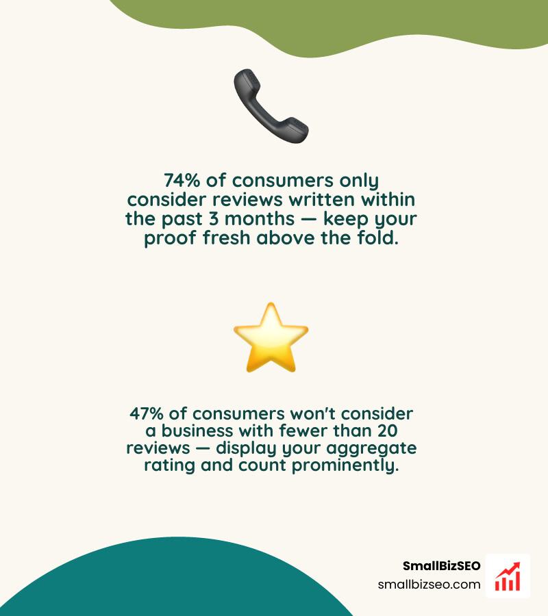
Trust must be established before asking someone to pick up the phone. According to consumer research, 97% of people read online reviews before contacting a local business, and 47% will not consider a business with fewer than 20 reviews. Furthermore, 74% of consumers only care about reviews written within the past 3 months.
To satisfy this need without cluttering the screen, place a horizontal proof bar directly beneath your primary hero headline and call-to-action.
- Aggregate Star Rating: Showcase your rating alongside total review count (e.g., "★ 4.9 Stars across 250+ Verified Reviews").
- Licensing & Insurance: State your licensed, bonded, and insured status clearly.
- Warranty/Guarantee: Display a concise badge (e.g., "100% Workmanship Guarantee").
Rather than crowding the hero with lengthy testimonial quotes, keep your above-the-fold proof concise and punchy. For design frameworks tailored to regional service markets, the A – Z Guide to Website Design in New York: Local Services offers useful structural insights on balancing brand proof with visual breathing room.
How Should Emergency and Considered-Purchase CTAs Differ on Mobile?
Your primary Call-to-Action (CTA) depends on your industry's buying cycle. An urgent emergency (like a burst pipe) requires immediate voice contact, whereas a considered purchase (like a home remodeling project) requires lower-commitment inquiry paths.
| Feature | Emergency Local Service (e.g., Plumber, Towing) | Considered Purchase (e.g., Bookkeeper, Remodeler) |
|---|---|---|
| Primary Goal | Direct phone call right away | Consultation booking or quote request |
| Main Hero CTA | Click-to-call button (tel: link) |
Short estimate request form / scheduler |
| Secondary CTA | Simple callback form | Downloadable pricing guide or case study |
| Target Mobile Action | Immediate tap-to-call dialer trigger | 3- to 4-field inquiry form |
| Header Integration | Sticky click-to-call bar on screen top | Persistent "Request Estimate" button |
All mobile tap targets must adhere to accessibility standards, maintaining a minimum size of 24 by 24 CSS pixels so users can tap them without misclicking. Implementing clear, action-oriented button copy (such as "Call Now for Dispatch" or "Get Your Free Quote") plays a massive role in improving your overall conversion rate.
A strong hero section does not stop visitors from scrolling; it encourages them to explore deeper. When designing above the fold, ensure that your visual hierarchy guides the user's eye naturally toward additional information below.
Technical performance is critical to this experience. Google evaluates technical speed through Core Web Vitals:
- Largest Contentful Paint (LCP): Must occur within 2.5 seconds.
- Interaction to Next Paint (INP): Must remain at 200 milliseconds or lower.
- Cumulative Layout Shift (CLS): Must measure 0.1 or less.
Heavy background videos and auto-rotating image carousels often destroy these scores. Sliders act like visual white noise—visitors rarely wait for slide two to load. Replace bloated carousels with a high-resolution, static image of your team, branded vehicle, or real work.
How Can a Homepage Avoid False Bottoms to Encourage Scrolling?
A false bottom occurs when the design creates an artificial visual barrier—such as a solid horizontal line, uniform color break, or excessive whitespace—that makes visitors assume the webpage has ended.
Research in conversion rate optimization reveals that encouraging users to explore past the hero section can increase a page's conversion rate by 36%. In fact, longer informative pages often outperform shorter pages by up to 52% to 78% when users are guided down smoothly.
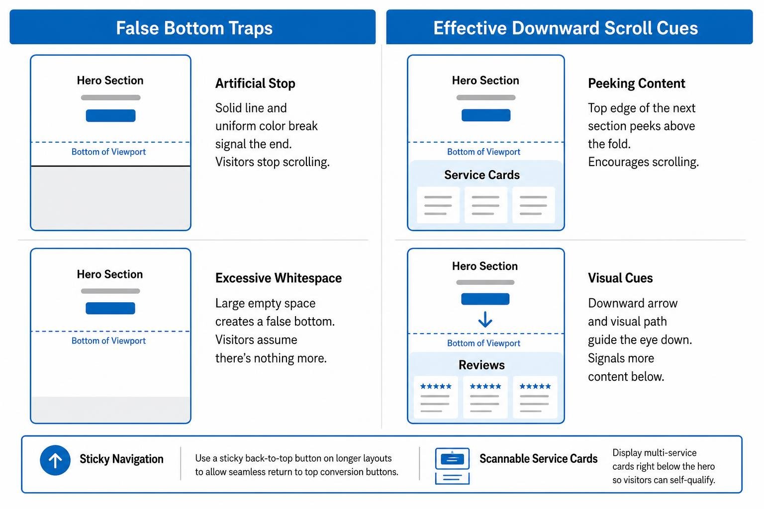
To keep visitors moving down the page:
- Peeking Content: Allow the top edge of your next content section (such as service cards or a review block) to peek above the bottom viewport fold.
- Visual Cues: Use subtle directional arrows or downward visual paths.
- Sticky Navigation: Implement a sticky back-to-top button on longer layouts to allow seamless return to top conversion buttons.
- Scannable Service Cards: Display multi-service cards right below the hero so visitors can self-qualify.
You can streamline this layout using our free small business website conversion kit to audit your visual containers.
How Do Above-the-Fold Elements and the Five-Second Test Support Local SEO?
Local search algorithms rely on three core pillars: relevance, distance, and prominence. In fact, geographic proximity accounts for roughly 55% of local-pack ranking influence.
Your homepage hero directly supports local SEO when its visible text reinforces your business profile data. Maintaining consistent business details is vital; our guide to NAP consistency explained details how matching your business Name, Address, and Phone number across directory ecosystems prevents ranking drops.
To determine if your first screen is working, run the Five-Second Test:
- Open your homepage on a mobile phone.
- Hand it to someone unfamiliar with your business for exactly five seconds, then take it back.
- Ask them: What service do we provide? Where do we work? How do you contact us?
If they cannot answer all three questions instantly, your hero section needs streamlining.
Building a Hero Section That Turns Visitors into Customers
Your local service homepage has a single priority in the first viewport: providing immediate clarity. By displaying your primary service, target area, verified social proof, and a friction-free call-to-action before the user scrolls, you remove doubt and turn search clicks into paying clients.
At SmallBizSEO, we build data-driven SEO frameworks that align your search visibility with conversion-focused on-page design. If you want to identify where your homepage may be losing leads, explore our specialized SEO visibility audit to optimize your hero section for maximum growth.